Network visualisation for a climbing wall

It’s April 2020, and as countries across the world find themselves under lockdown, I am inclined to do something fun with data for a change.

Rock climbing, particularly indoor bouldering has seen an explosion in popularity in recent years. Many people will be familiar with the concept, but here is a brief explanation; in this discipline, you climb a short wall using a sequence of holds, or ‘problem’, using your hand and feet, with no rope protection. These sequences are typically short, highly gymnastic and, when indoors, performed in a controlled environment. However, while most indoor climbing walls look like this:

My local climbing wall looks like this:

This beauty is the climbing wall at the University of Oxford Iffley Road Sports Centre. It is a fine example of pre-1990s climbing walls, before the advent of the modern climbing gym, with some unusual and curious features. First, unlike modern climbing walls where plastic holds are regularly replaced and reconfigured, here, climbing holds are permanent. You might notice they are chunks of rock literally cemented into the wall. Second, holds can be used across multiple sequences. This is particularly unusual, in that many sequences overlap over the same holds. As I sat here pondering, I became particularly interested to see if I could generate a visualisation that captured this feature of shared holds that is fairly unique.

Thankfully, two amazing climbers made this task possible; Steve Broadbent who literally wrote the (guide)book for the Iffley wall, and Jamie Bickers, who created and continues to curate a database of climbing problems at Iffley.

First: an explanation. I decided to interpret the climbing wall information as an undirected graph. This has three distinct advantages. First, a network graph allows relational information to be represented at multiple levels. This enables the user to easily answer both macro (e.g. how densely connected is the graph?) and micro (e.g. is there a connection between node A and B?) questions. Second, it allows for the representation of dense information. In this example, all holds (nodes) within a problem are connected to each other. The network is undirected, as climbing problem information is undirected – you are presented with a series of holds, but no instruction as to what order they should be arranged in. Finally, this visualisation allows the identification of ‘hubs’ – that is, nodes that serve as central connection points to join different parts of the graph. It is immediately striking that the arête forms a central hub. I’ll leave it to the reader to find other interesting features in the network.

Click for an interactive display.

—————————————————————————————————
Modern bouldering photo by Yns Plt on Unsplash. Original data generated by Steve Broadbent, Jamie Bickers, and many more Oxford University Mountaineering Club members. Network modelling in MATLAB and visualisation in Gephi. Web deployment with Sigma.js. Interactive network visualisation hosted on GitHub.

This article was originally published on 2 April 2020.

Are there record fires in the Amazon?

It’s late August 2019, and plenty of news outlets are reporting forest fires in the Amazon rainforest. The news stories revolve around two points; one, that the fires are of an unprecedented scale, and two, that the policies of Brazil’s president, Jair Bolsonaro, are to blame for the increase in deliberate fires created by farmers and loggers. A particular amount of attention is being paid to the number of fires within Brazil, with statements such as:

Amazon wildfires at record numbers, says Brazil’s space centre

The Irish Times

This year has seen more than double the number of fires in Brazil than in 2013

BBC News

But is the number of fires truly exceptional in 2019? Forest fires, deliberate or otherwise, are a feature of tropical rainforests during the dry season. We expect a certain number of fires to occur with cyclical regularity. However, if the number or extent of the fires exceeds our expectations, this would be cause for concern. Let us look at the data.

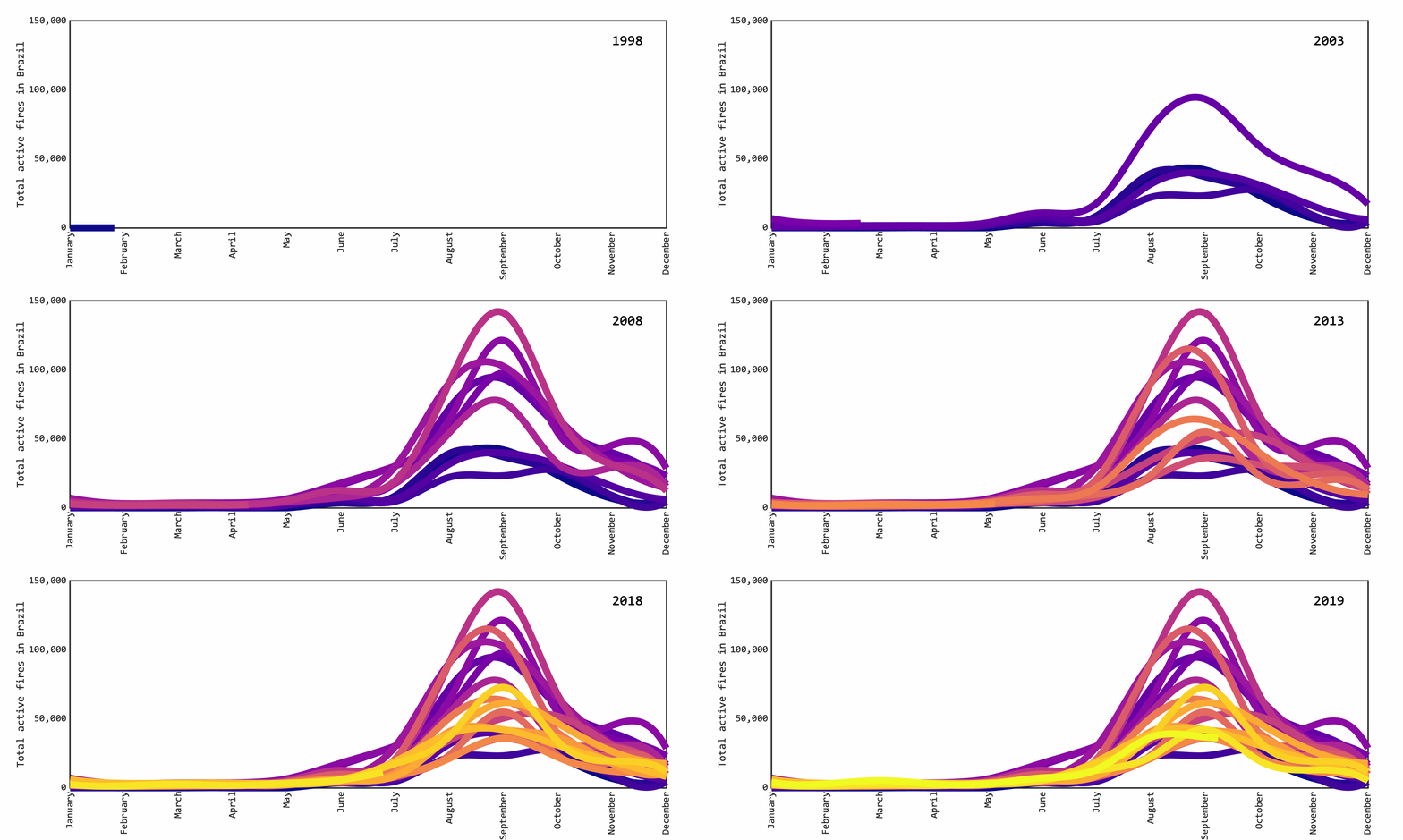
The National Institute for Space Research of Brazil (INPE) maintains a public database of forest fires detected through satellite imagery across South America. Focusing on Brazil alone, we can look at historical data for the number of active fires for each month. We see that forest fires have a seasonal effect, with a spike during the dry season of July to October, as well as year-on-year variation.

With this historical view, 2019 does not seem to stand out; however, we do not yet have data for September, the most active month for fires in Brazil. Let us look instead at the cumulative number of active fires in each year, leading up to the month August.

Here we see that 2019 has had an unusually large number of fires so far, compared to the same point in the previous two years, but it is still lower than for the 2002-2007 period, where many more fires were reported by this point in the year. We might reasonably ask if the forest fires in August 2019, while unusually numerous, fall within the normal variation of fires reported for equivalent August periods in previous records.

We can answer that question by looking at the expected range (confidence interval) of the number of fires for any given August. For the 20-year span up to 2018, we can say that 95% of the time, there were between 36,000 and 57,000 active fires on any given August. For the current year, that value is presently at 36,785. This number will likely rise, as they are 8 days still left in August, but when assessed in this fashion, 2019 is not a statistical outlier.

What are we to conclude? Are the forest fires in Brazil exceptional this year? Perhaps in scope or intensity, but when considering the number of individual fires alone, it is not. The records so far shows an increase compared to the previous two years, but it is not abnormal within the range of forest fires reported over the past two decades. Are forest fires going to get worse? In the immediate future – yes. September is historically the month with the largest number of fires in Brazil, so we are likely to continue to see the Amazon in the headlines.

—————————————————————————————————
Satellite imagery data is provided by Instituto Nacional de Pesquisas Espaciais (INPE) of the Brazilian Ministry of Science, Technology and Innovation. For full details on methodology, see their wildfire database and documentation.

This article was originally published on 23 August 2019.

The politics of Eurovision

Ah, Eurovision. It’s the time of the year for power ballads, glittery performances, and some serious scrutiny of European political sentiment. The Eurovision Song Contest is an international competition where each participating country enters a musical performance, and they get paired down up to a final 26 contests who duke it out at a final live television show. Votes are awarded from each country, before the winner is crowned. While the music and performance is sometimes interesting, often extravagant, what interests us today is how the winner is selected. For the first 40 years of the history of the contest, each country would appoint a jury panel who distributed points to their favourite songs. However, since 1997 a form of split representation has been used, where countries combine a jury vote and an audience vote via telephone or text message to allocate their points. Since every participating country gives points to other countries’ songs, who favours whom has been classic fodder for media articles the night following the Eurovision final for years.

What can we learn? The dual voting system is particularly interesting, because it allows us to disentangle the preferences of the appointed jury and the collective sentiment of the millions-strong audience. While the former can be considered a professional body and (in theory) guided by aesthetic considerations on the quality of the music and performance, the latter is swayed certainly by the songs, but also by attitudes the public hold towards the countries each singer represents. To test this idea, we explored the publicly available data for the past six contests, going back to 2014, by comparing the voting patterns in each participating country between the jury and public vote rankings.

Here we see the distribution of the votes awarding countries (rows) to each country with a performance in the grand final (columns), for the 2019 contest. Eurovision uses a rank voting system, where each country ranks their top 12 performances, with 12 being the maximum number of points awarded per country. In addition, and country awards points through both a jury panel and a public vote. For example, the Netherlands received high-ranking votes from many countries, which propelled it to victory, whereas Georgia received few votes from a handful of countries. Interestingly, we do see examples of jury vs. public discrepancy, where the runner-up Norway received high-value votes from a wide field of countries in the public vote, but was largely panned by the jury vote across the board. If we compute the difference between the jury and public votes, we get a map like this.

Now it is more obvious that the public at large enjoyed Norway’s performance. The respective juries from each country, not so much, who seemed the prefer Azerbaijan over and above the preferences of their voting public. Next, let us take the average jury vs. public discrepancy for each awarding country, and look at the long-term trends.

This figure shows the mean yearly difference in jury vs. public votes (black dot) and the year-on-year variance (blue bar) for each participating country, for the period 2014-2019. Note that some countries have only taken part in one contest in this period, so no variability is shown. With this metric, we see Bulgaria has the largest divergence in votes – its public and judge panels disagree, on average, more than any other Eurovision participating nation. Cypriots, on the other hand, tend to agree the most.

One last question we will ask is, which countries do the public and judges disagree the most over? For each awarding country, we will look at which performance has the highest disagreement in votes, and tally up the number of times performers from that country generates the highest disagreement. For the 2014-2019 period, we get the following result.

We can now safely crown Albania as the country who, overall, generates the most disparate feelings between the public and juries during Eurovision.

This little exercise allows us to inspect the trends in opinion of, yes, a small event, but over a large number of participating individuals across a vast geographical area. While the geopolitical consequences of a song contest might be limited, it is a valuable approach that can be leveraged when examining trends in public opinion, particularly when large datasets can reveal useful information about transnational differences and similarities.

—————————————————————————————————

The voting history of the Eurovision song contest votes for the period 2014-2019 is available here, with only the grand final considered in this article. Votes for the 2019 contest are correct as of  22nd May 2019, following changes to the Belarusian jury votes.

This article was originally published on 7 June 2019.

The most dangerous airline in the world

Nothing excites a statistician’s heart quite like morbidity. After all, people might not care much for numbers in most things, but if there is chance it might kill you, people tend to listen. And airline safety is hardly a fringe topic. It has been covered extensively in the news, particularly after high profile events such as the disappearance of MH370 over the Indian Ocean, and the downing of MH17 in eastern Ukraine (Malaysia Airlines did not have a good year in 2014). So how do we quantify airplane safety?

A straightforward way to look at it, is simply to count the number of airplane crashes that resulted in at least one fatality. We will include all commercial flights, both national and international that carried passengers. This means looking at both the big airline brands, but also the more accident-prone firms flying small turboprop planes. We will exclude cargo, rescue and military flights, as they operate under very different conditions, and are arguably not relevant to the vast majority of air travellers. On the other hand, we will include any cause for the crash, both accidental (e.g. engine failure) and intentional (e.g. military action) resulting in loss of life, as long as the affected airplane is on a commercial flight.

Fortunately, commercial airline accidents are pretty rare. In 2017 there were just 5 accidents that meet our criteria, with a total of 13 casualties. In fact, 2017 was the safest year on record for commercial airlines. However, it seems unfair to judge airline safety based on performance in a single year, since accidents are so rare. Equally, it would be unfair to judge an airline today by their record in the 1970s and 80s, a time when airplane crashes were more common, and many modern carriers didn’t exist yet. Instead, we can look at a 20-year window (1997-2017) to get an idea of the relative safety of different airlines.

As you can see, not one airline has a monopoly on airplane crashes. Most airlines on the list have suffered one or two deadly crashes, with the largest number being 3 for Hageland Aviation Services, a medium-sized provider operating out of Anchorage, Alaska. Many big names such as Delta, Lufthansa or KLM have not suffered a crash leading to fatalities in the last 20 years.

Perhaps more interestingly, we can consider how many crashes airlines experience in relation to their operation size. If an airline operates many flights a year, we would expect an accident to occur eventually. Equally, if an airline operates few flights but experiences a large number of crashes, that is cause for concern. To simplify the process, we will only consider airlines that have experienced two or more crashes in the last 20 years. The number of flights operated are difficult to ascertain, and is a number that fluctuates from year to year. Instead, we will take the fleet size – that is, the number of airplanes registered to a given airline – at the most recent time of operation, and compare it to the number of crashes it has experienced.

it is evident from the data that there is no relation between fleet size and the number of crashes. We have very small operations such as Karibu Airways with a single plane, all the way to Malaysia Airlines, one of the largest operators in the world with 71 aircraft in operation.

So far, we have looked at the frequency of crashes, but what if we looked at the deadliness of crashes? Do any airlines stand out?

Here the size and colour correlate with the total number of fatalities across all crashes for that airline in the 20-year window. One clear stand-out is Malaysia Airlines. The two crashes we mentioned above, MH370 and MH17, make up a total of 537 casualties, which is by far the largest loss of life in commercial aviation in the past two decades. Both Air France (in 2009) and Metrojet (in 2015) suffered crashes leading to the loss of 228 and 224 people, respectively. Interestingly, there is no clear relationship between fatalities and airline – not by fleet size, geography, or other indicators.

While we might be tempted to interpret these data as nudging us not to fly with one airline or another, the truth is that airplane accidents are thankfully so rare that is difficult to determine how risk factors may vary, if at all, from one airline to another. However, we can still make one more assessment – if we were to experience an airplane crash with one of these companies, how likely are we to walk out alive? We can quantify this by using this simple formula to calculate a survivability rating:

1 – (fatalities / people on board)

Where a value approaching 0 means most people on board perished, while a value approaching 1 means most people on board survived.

First, some bad news. Most airplane crashes that result in a fatality tend to be bad. Of the 220 crashes involving at least one fatality in the last 20 years, 128 of them resulted in the death of all passengers and crew members. The average survivability of crash is 0.24, meaning on average, only around 24% of people on board survived. The good news is that there are a few airlines with lucky breaks; Asiana and Dagestan Airlines for example, both experienced emergencies with large numbers of passengers (100+) and managed to land with few casualties. Of course, there are many airplane accidents that do not result in fatalities, but of those who do, these are the lucky ones.

As a final point, it is worth stressing that air travel remains, on average, an extremely safe method of transport. While every single of these deaths is a tragedy, a total of 5,979 deaths in worldwide commercial aviation deaths over 20 years, or around 300 per year, is a tiny amount. You are over twice as likely to die cycling in the United States (818 fatalities in 2015) or around 4000 times more likely to die in a road traffic accident worldwide (estimated at 1.25 million deaths in 2013). So continue flying, and rest assured that no matter which airline you choose, you are using probably the safest method of transport.

—————————————————————————————————

Airplane accident data from planecrashinfo.com and dot cluster illustration made with RAW Graphs.

An honourable mention is due to an intoxicated man who, on the 11th June 2012, stole a Antonov AN-2 and crashed it near Serov, Russia. Official cause of accident: Illegal Flight.

This article was originally published on 28 February 2018.

How wrong are the UK election polls?

Representative polls of voter intention are our best tool for forecasting how an electorate will vote in a free and fair election. On the 8th of June 2017, the United Kingdom will go to the polls once more to elect members of parliament, with the Conservative party seen as the favourite to win, and the opposition Labour party (as of 3 days before polling day) seen as quickly gaining momentum.

This election is unusual in many ways, but one glaring feature is the widespread distrust of polling forecasts from all sides of the political spectrum. This is unsurprising, given that the majority of polls failed to correctly forecast the 2015 general election or the 2016 referendum on the UK membership of the European Union.

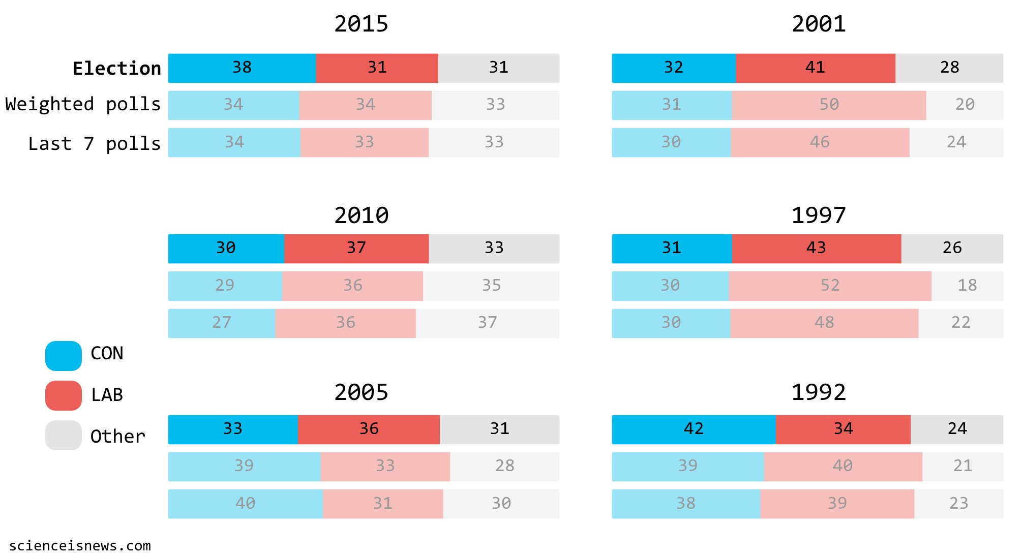
But are polls really that bad? After all, we know voting intention polls are imperfect; they have small sample sizes, may be biased by methodology, experience short-term swings by current events and struggle to reach certain demographics. Pollsters typically claim a margin of error of ±3 percentage points, based on internal validation of their methods. Fortunately we have another way of quantifying just how bad the polls are at forecasting election results – looking at past elections. To assess this, I collected published polls on voting intention for the two major parties (Labour and Conservatives) between the announcement of a general election and polling day going back to 1992. To quantify the error, we can take a snapshot of the polls  and compare the forecast against the outcome of the election.

We often look at averages of polls, because any given poll will be subject to noise; either because any given sample will never be perfectly representative or because of biases in the methodology used by the pollster. And because opinion changes with time, we tend to look at the most recent polls. Here we have two alternatives, an average of all the polls conducted during the campaign period, weighted for recency[1], and an average of the last seven poll before polling day, as favoured by UK newspapers.

The mean error between polling averages and election results for this period is between 6 and 7 percentage points, depending on how you average polls. Clearly, this is not a very good forecasting model when elections over this period were decided by an average vote difference of 7 points between the two major parties. In other words, a typical post-1992 UK election is, on average, ‘too close to call’ based on polling forecasts with the error margin being as large as the point difference between the parties.

What does this tell us about the 2017 election? Well, the polls currently stand like this:

With a weighted average of polls since the election was called on 19th April, the Conservatives stand with a more than ample margin of 18 percentage points. However, recent weeks have seen Labour clawing back some territory, with the last seven-poll average putting them 7 points behind the Conservatives. Based on the error rates self-reported by individual pollsters, or long-term projections this places us within safe territory for the Tory party. However, if we wish to take the recent polls and looking at the historical accuracy of poll forecasts taken as a cumulative model, it places us within a possible polling error upset.

Taking the 60-odd polls conducted in the last month, we can model voter preference for the Labour or Conservative party as a normal distribution, which approximates the data fairly well[2]. We can then ask what is the probability that a larger share of the electorate votes for the underdog than for the favourite, i.e. a forecast upset. For the model derived exclusively from 2017 polling data, we can expect a 5% chance of an upset, which places the Conservatives in a secure place. However, the polling error rate is not well reflected in the internal variance of the polling sample, so we can adjust the error rate by the expected range seen in the historical data, i.e. ±7 percentage points. This simulation gives us a probability of a forecast upset of 11%, or to put it another way, if pollsters are making the same errors since 1992, there is a 11% chance they have wrongly forecast the Conservative party as securing more votes than the Labour party on the 8th June.

However, it should be noted this is not the whole story. UK general elections are not decided by a single party capturing the plurality votes, but by forming a majority in Westminster through a byzantine system of local seat elections. The First Pass The Post system results in a winner-take-all outcome for individual constituencies. If one candidate secures more votes than any single other candidate, they can, and often do, win the constituency with less than 50% of votes, meaning a majority of votes in that constituency did not contribute to the overall outcome of the election. Much has been written about First Pass The Post, but suffice to say for our discussion that this system makes translating voter intention polls to parliamentary seats a notoriously tricky problem. Second, UK governments can be formed by political coalitions when one party does not hold absolute majority in the House of Commons, as happened in 2010 when a Conservative and Liberal Democrat coalition assumed power. In this scenario it is not the overall majority of parliamentary seats that matter, but the proportion of seats controlled by each party. Both of these complications mean a forecast purely based on the share of the vote captured by each party is an insufficient model of the UK general election, and with a large error rate based on historical performance to boot.

What should we make of this? As it stands, the Conservatives retain a comfortable lead, but the error margin is much larger than you might guess by looking at 2017 polls alone. While it might be tempting to keep checking the worm of public opinion swing up and down on daily poll trackers, remember to take it with a pinch of salt.

—————————————————————————————————

[1] Polls are weighted with an exponential function, giving larger weights to polls conducted closer to polling day. For the simple seven-poll average, no weighting was applied.

[2] The Gaussian model explains >99% of the data (R2 = 0.9994). This model includes all publicly available polls carried out between the day the election was called (19th April 2017) and the time of writing (5th June 2017). The model does not weight samples by recency, nor by accuracy of the pollsters, both of which would be sensible additions for future models.

Polling data were obtained from UK Polling Report and Opinion Bee. There is a never-ending stream of UK election poll trackers, but I recommend checking out the Financial Times, Economist or Guardian for their sound methodology and excellent visualisations.

The world to the polls

Ah, 2016 – the electoral year that keeps on giving. From the UK EU membership referendum, a narrow miss for the Pirate Party in Iceland’s parliament, an Austrian presidential election postponed thanks to faulty glue, and over 100 other elections and referenda worldwide. And lest we forget, the ongoing US presidential election, now just five days away.

The race for the White House is currently disputed between the Democrat candidate Hillary Clinton and Republican candidate Donald Trump, with polls showing a tightening race in the final stretch. While the US is trapped in feverish speculation and much hand wringing at the latest poll results, the rest of the world watches silently as the next Western hegemon is chosen. But perhaps not so silently, as a few news outlets have taken to asking citizens outside the US about their opinion on the current electoral process. Given the significant international repercussions any electoral result will have, it poses an interesting question – if you are a citizen of the world, which candidate would you vote for?

Now, many of these are not scientific polls, but what polls analyst Nate Silver of FiveThirtyEight has taken to calling “clickers”, in that you put a straw poll on the internet and have visitors click on their preferred candidate. It should be immediately obvious that there are flaws with this approach, including a self-selection bias for respondents, no accounting for demographically balanced sampling and the opportunity for abuse by users casting votes multiple times. At best, “clickers” represent a minority of internet-using, English-speaking people who happened to come across your straw poll. And worst, they are fundamentally flawed exercises that tell us nothing useful.

One interesting exception is a recent poll conducted by WIN/Gallup International, using scientific polling methodology (Technical note: WIN/Gallup International is not affiliated with the more well known Gallup consortium, and I have not formed an opinion on the reliability of their work, but the methodological notes provided in the report check out, and are broadly in line with best practise in scientific polling). This poll asked people in 45 countries the following question:

“If you were to vote in the American election for President, who would you vote for?”

And the results are quite fascinating.

One popular interpretation of the unscientific "clicker" polls is that the world leans Democrat, while Russia is the lonesome supporter of the Republican candidate. Does this bear out in scientific polling? The short answer is yes: every other country surveyed gives Clinton an advantage except Russia, where 33% of respondents would vote for Trump compared to 10% who would support Hillary. What these stories ignore, however, is the clear majority of Russians surveyed did not side one way or the other, with 57% declaring “Don’t know/no response”. So the majority of Russians surveyed would not vote for Donald Trump, but instead have no defined opinion or declined to comment.

The second narrative that has emerged from worldwide polls is the overwhelming support for the Democrat candidate across the globe. Indeed, the average across the 45 nations surveyed gives Clinton a +50% lead, while current estimates give her a measly +3.1% lead in the US popular vote. It might shock some readers that there is such discrepancy between popular opinion in the US and the rest of the world, but this discrepancy is far from homogenous.

If we want to bridge the divide, we can then ask: what country from the 45 surveyed most resembles the US today? Let us look at the map:

Surprisingly, the country most similar in popular opinion to the US right now is China. With 53% favouring Clinton and 44% favouring Trump, that gives Clinton a 9% lead, still larger than the actual lead in US polls. China also has the lowest number of undecided respondents (3%) of the 45 countries surveyed at, even lower than the US electorate currently at 5%. Let us reflect on the fact that people literally on the other side of the world are more likely have made up their minds about these two candidates, than the citizens actually having to vote less than a week from now.

We can take this further and inspect polling not country by country, but state by state. One of the advantages of the unrelenting scrutiny of the electorate we see in US presidential elections, is that we get continuous polling from each individual state on a near-daily basis. For this step, we will take the weighted polling average for each state as provided by FiveThirtyEight and compare them with the individual polling results for non-US countries (Technical note: polling adjusted for recency, likely voter ratio, omitted third parties, and pollster house effects. Full methodology here).

The countries that are most similar in presidential candidate leaning to US states are far and away Russia (Trump +23%) and China (Clinton +9%). These two alone account for the majority states, 44 out of 50 (plus DC). This translates fairly well to the individual state polls – a strong preference for Trump in the Midwest and South, and lukewarm but widespread support for Clinton elsewhere. A handful of other states are most similar to four other countries (Lebanon, India, Bulgaria and Slovenia), all Democrat-leaning.

What does this exercise tell us? First, it shows how US political races divide opinion worldwide. While most of the 45 countries surveyed were Democrat-leaning, there is significant heterogeneity in the level of endorsement for Hillary Clinton, with strongest support in Western Europe and Latin America and weaker support in Africa and Asia (albeit from a limited sample of countries). Second, the story of “Russia supports Donald Trump” does not check out. A larger group of respondents in Russia expressed no opinion about the election than supporters of Clinton or Trump combined. Finally, state-wise analysis shows that worldwide opinion are not good models of regional US political leanings, with the extreme countries in the survey (Russia: strong Republican, China: lukewarm Democrat) being most similar to individual state polls.

If you are in the US, perhaps time to consider a vacation in a political soul mate across the globe?

—————————————————————————————————

Survey of opinions on US election in 45 countries carried out by WIN/Gallup International and released here. US national and state poll averages from FiveThirtyEight aggregates. Number of undecided voters aggregated by the Huffington Post. All polling indices current as of 3rd November 2016.

This article was originally published on 03 November 2016.

How to lie with polls

Referenda – love them or hate them, they are a mark of modern democracies. In the next few weeks, the United Kingdom will vote on whether to leave or remain in the European Union. It’s a historic vote, with significant repercussions not just for the UK, but also for the future of the European project.

Of course, when the stakes are high, the prognosticators get called in. Much has been made of the very tight race in the polls, with newspapers often lauding the results of the latest poll as the final say in the debate.

But any observer with a passing interest in statistics will know this is a misguided conclusion. Just because a poll is more recent, doesn’t mean it’s more accurate. Polls vary in their quality, representativeness, and will experience some natural variation, which is why seasoned observers will follow the trend in a population of polls instead.

As a quantitatively-minded person, I take particular offence at the way polls are being displayed in summary fashion, particular this heinous graphic at the Telegraph:

Polling, as it turns out, is a fantastic example of how easy it is to misguide, misdirect or downright lie with statistics. So let us look at the different messages we can glean from the EU referendum polls. As our source, we will take every leave/remain poll result from the comprehensive tracker made available by the Financial Times, going back to 2010.

First, we want to try and go beyond just parroting what the latest poll tell us. Using the most basic summary metric, the arithmetic mean, we can get an idea of what a population of polls tells us about public opinion over a six-year span. We can see the remain camp leads across polls with 2 percentage points. Good news for Europhiles.

However, this is a misleading conclusion. Firstly, we are ignoring how much opinion varies from one poll to the other – this could be due to biases of particular polling companies, of the method used, or simply noise in the sampling process. Secondly, it's opinion now and not four years ago that decides a referendum, so we may want to apply a weighting scheme where older polls count less than more recent polls. If we include such weighting, and add the standard deviation of opinion across polls, the story becomes a bit more muddled – no party has any clear advantage above the variance in the data.


Public opinion, of course, changes with time. A traditional way of displaying poll results is to show answers to the same polling question across an arbitrary timespan. This has the advantage of revealing any strong trends in time, but also leads us to over-emphasise the most recent results, be it because they represent the will of the people or because of spurious trends. With this approach, we can tell a very different story – the leave camp appears to lead in the most recent polls.

Taking a different approach, we can also look at polling as an additive exercise. If we take the difference in responses to leave and remain at each poll, it gives us a net plus-or-minus indicator of public opinion. We can then plot these differences as a cumulative sum over time, to estimate whether a given camp gains ‘momentum’ over a sustained period of time (this approach has garnered significant favour amongst news outlets covering the US presidential primaries);

In this case the leave camp not only comes on top on recent polls, but also is shown as having gained considerable momentum in the last few months of 2016, usually taken as indicative of a step change in popular opinion. A very different story from our original poll average.

The problem with these past approaches, is that they fail to encapsulate uncertainty in a meaningful way. We can take yet another treatment of the data, and ask what does our population of polls show across all samples, and fit a mathematical model that allows us to describe uncertainty.

Here, we see a histogram of individual poll outcomes and a simple Gaussian model of the responses, across six years of polling. We see that while there is significant spread in responses, overall the stay camp has an advantage, but still sits within the confidence zone of the leave camp; in other words, it’s pretty close. But what this, and most polling trackers often fail to acknowledge is the large number of undecided voters who could swing the referendum either way. On average, 17% of those polled were undecided, with 12% still undecided in the last month. If we include the uncertainty of undecided voters into our simple model, we can see a vast widening of our confidence margin;

And no significant advantage to either the leave or remain camps. What this exercise demonstrates, is that data literacy goes beyond being sceptical of statistics in the news. Interpretation is not just dependent on knowing what you are being shown, but also on understanding that different data crunching approaches will favour different interpretations. We should be mindful of not just what data is shown, but how it is presented - data visualisation plays a large role in guiding us towards interpretation.

—————————————————————————————————

Poll trackers have been made available by the BBCEconomistTelegraph and Financial Times.

Analysing outcome likelihoods in the real world is a risky business. But if all else fails, you can always rely on the one interest group that has a consistent stake in accurate outcome prediction - betting companies. OddsChecker currently has best odds for a leave vote at 11/4 (27% likely) and stay at 1/3 (75% likely). Make of that what you will.

This article was originally published on 10 June 2016.

The longest race

Ah, it’s spring; the flowers are out, the sunshine pokes through the clouds and the smell of democracy is in the air. No, I am not talking about the Ghanaian or Philippine general elections, which are indeed taking place this year, or the whooping 8 elections and 1 referendum taking place in the United Kingdom. I am of course talking of star-spangled democracy with a capital D – the 58th United States presidential election.

As discussion of the presidential candidates heats up in the media, the casual reader might be forgiven for thinking this campaign has been going on for years. In fact, much has been written about the perceived length and strain of the presidential campaign, with many commentators labelling it as ‘absurd’.

This piqued my interest and made me wonder if the US election race is truly an interminable soporific, or whether it could be attributable to perception alone. After all, the US is a world leader in most international matters, and the election of the president is the high point of the political calendar, so extensive news coverage is to be expected.

To find out, we will need to compare the length of the US election to equivalent elections in other countries. I have chosen to do this with the other 33 OECD nations, the rich-world club of industrialised economies that are most similar to the US in terms of economic prosperity and demographic makeup.

Now, defining an election campaign is a tricky business. Some countries like Canada and Australia limit the duration of a political campaign by law, but most don’t. Others like Slovakia limit the funds available to each party for campaigning, while others have free-for-alls. Ultimately, we are interested in the number of days viable candidates do spend campaigning for their election in a major race in a given OECD country; be it general, presidential or parliamentary election.

We will therefore have to make some rules. When no legal limit is imposed, we will take the number of days between the first announcement of a major candidacy (so no Monster Raving Loony Party) and voting day. This works well for most countries except for the Scandinavian nations, where candidates typically don’t launch their campaign individually, but rather their party does. In such cases, we will take the last date for valid submission of candidacy as the starting point, and voting day as the end. In all cases, when legal limits are not present, we will use the last major election as indicative.

The United States is, unsurprisingly, an oddball case here. We can divide the US presidential campaign into two halves. First, the time between a major candidate announcing their intention to run for office and the party national convention, can be considered the first leg of the race. Following the convention, each party selects a candidate and the second leg goes from nomination to election day. A few other countries conduct this out-of-season political campaigning, most notably Italy, so we have included those as well.

For the 2016 presidential race, Hillary Clinton was the first major candidate to pronounce herself on 12th April 2015 towards the Democratic convention in late July 2016. The race then goes on until Election Day on the 8th November. How does that compare to the other OECD nations?

By a wide margin, the United States remains the undisputed leader of absurdly long election races. South Korea and Italy are notable outliers, both countries that engage in similar pre-campaign campaigning; but at a mere 241 and 190 campaign days in their last electoral cycles, they are dwarfed by the gigantic 576 days of US presidential campaigning. At the other end of the scale, Japan imposes a restrictive maximum of 12 days of political campaigning, with heavy fines for any infractions inching over the two-week line.

Regulating campaign time is a comparably crude method by which countries limit political opinion making. Regulating party financing is arguably a much more effective way of doing this, and much has been written about the successes and failures of financial approaches. Alas, the US election remains, as of now, a wide field of possibilities for financial backing of political campaigns. And while that continues to be the case, we are likely to continue enjoying the marathon races that make up the US presidential election.

—————————————————————————————————

While researching this article, I discovered the curious practise of electoral silence, where countries impose a complete ban on political advertising or campaigning on the day, or the day immediately before, an election. These range from a reasonable 24-hour ban in Bulgaria, to the ludicrous 15-day ban on polling in Italy. In Spain, this day preceding an election is delightfully called “reflection day”. Perhaps we should all reflect on that.

This article was originally published on 26 April 2016.

Too big to print?

A friend recently asked me this question:

"Why don't they sell scientific journals in shops? That way, people could find out what science is going on."

 The idea was quite bizarre to my close-minded scientific head, and about a dozen potential replies circled my head. "Most people wouldn't understand it", "academic papers are not written for mass consumption", "we don't need to, we have science journalism in mainstream media" and "there would just be too much stuff".

In the end, I settled for "it's all digital now", which is true for the vast majority of scientific publishing - papers are increasingly published, purchased and consumed in digital format, with the sight of the actual physical print a rarity in most academic departments.

But this got me thinking. Why not? People have the right to buy scientific journals, particularly if they live in a country where research programmes are heavily funded by public entities - in fact, some people are arguing that they shouldn't have to pay at all. But could we do this with old-fashioned print version of journals? Could we put them in a shop? Just how much space would it take?

To find this out, we need to be a bit ingenious with numbers. According to the STM 2012 report on scholarly publishing, there were 1.8 million peer-reviewed papers published in 2012. Using growth rates estimated from a couple of sources, that number should hit around 2 million in 2014. If we presume our humble local magazine shop stocks these journals in the normal fashion, a new one every week, we are dealing with 38,462 articles a week.

How much paper is that? A peer-reviewed article is typically between 3,000 and 10,000 words and following a completely unscientific survey of a few representative journals I had lying around (Nature, Science, PNAS) the going rate seems to be 800-1000 words per page, pictures and all. This works out at an average of 7.22 pages per article, as a very rough guess. Multiplying that by the number of weekly articles our shop would need to stock, we get 277,781 pages, and if we add covers, editorials and advertisement we can reasonably round it up to 300,000 weekly pages being churned out.

Now the big question is whether our imaginary shop can actually hold that much content. With a typical magazine format of 120 pages in 12 x 28cm size, we are dealing with 2,500 unique weekly publications. Of course, we want to stock more than one copy of each, so 50,000 issues is not unreasonable. How much space would that take? At 8.50 m3 it would just fit into a large-ish transit van. Of course, if you actually want to be able to rifle through the contents, our shop would need considerable floor space. If you wish to display the journals face-on, as they typically are in book stores, it would need about 500 m of shelf-space.

Assuming absolutely no backlog and definitely not stocking the previous week’s edition, a very large, multi-storied shop could just about manage that. And it probably wouldn’t have room for National Geographic.

—————————————————————————————————

For numbers of scholarly articles published, this article by Larsen & von Ins (2010), as well as reports by STM and the Royal Society were particularly helpful.

This article was originally published on 24 January 2014.